.jpg)

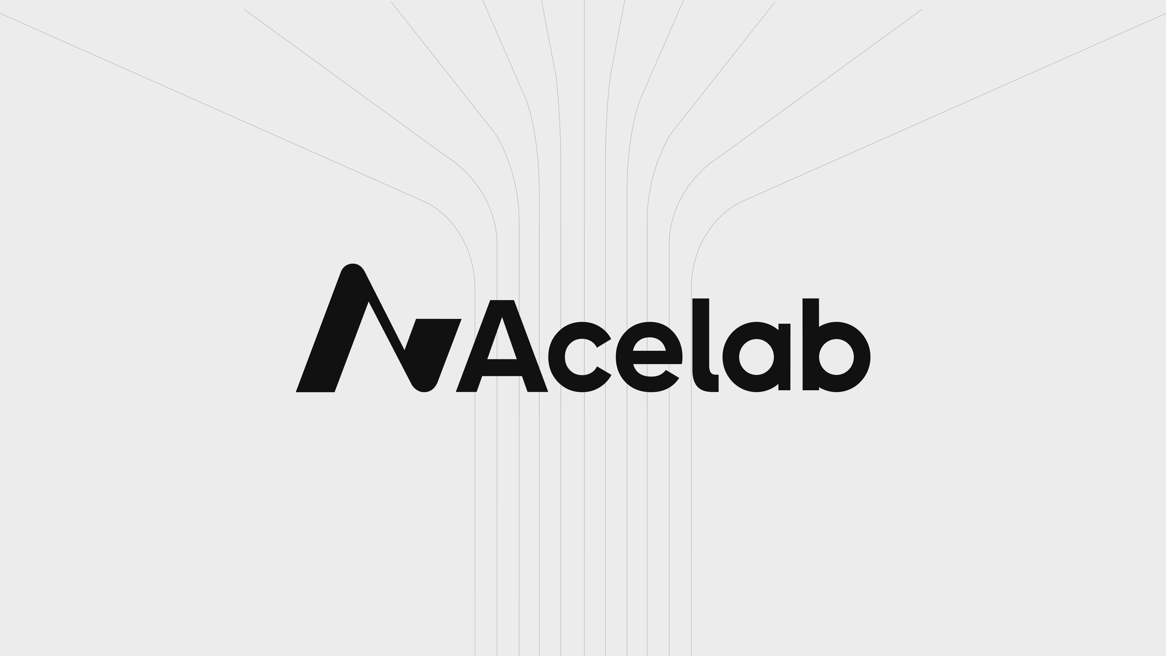
Acelab isn’t just organizing material data—it’s reshaping how architectural decisions get made. The brand needed to reflect that level of ambition. Where the old identity leaned heavily on product UI and conventional SaaS cues, the new direction elevates Acelab into something more enduring: a platform that feels foundational to the built environment itself.
As a growing platform reshaping how architects, owners, and manufacturers make material decisions, Acelab had built something genuinely powerful. But its brand wasn't keeping pace. The visual identity leaned hard into a dark, tech-forward aesthetic—heavy blacks, electric greens, dense UI screenshots, and a typographic system that felt more developer tool than design platform. In a space where trust, precision, and professional credibility are the currency, Acelab's brand was speaking the wrong language to the wrong room.
The Problem: Acelab's platform had matured well beyond what its brand was communicating. The previous identity—built around high-contrast black and green, Archivo typography, and a fragmented visual system—signaled startup energy where the product had earned enterprise authority. Collateral was inconsistent. The website felt cluttered and feature-led rather than value-led. And in a competitive landscape, Acelab's visual language was creating a perception gap that the product didn't deserve.The audience is architects and design professionals: people with a trained eye, high aesthetic standards, and zero patience for brands that don't communicate competence immediately. The old brand wasn't earning that first impression.
The Solution: A focused brand lift and complete digital overhaul—sharpening strategy, rebuilding the visual language, and redesigning the website to reflect the platform's true depth and the professionalism of the people it serves.
01: Brand Audit We started with a full audit across Acelab's website, collateral, social presence, and product surfaces. The pattern was clear: the brand had been built for momentum, not maturity. The black-and-green palette, heavy geometric logo treatment, and dark UI-forward layouts created visual tension with the actual user—architects and design leads who live in clean, considered environments. The audit anchored the strategic direction: move away from tech-tool aesthetics and toward the visual language of the design and architecture world Acelab actually serves.
0
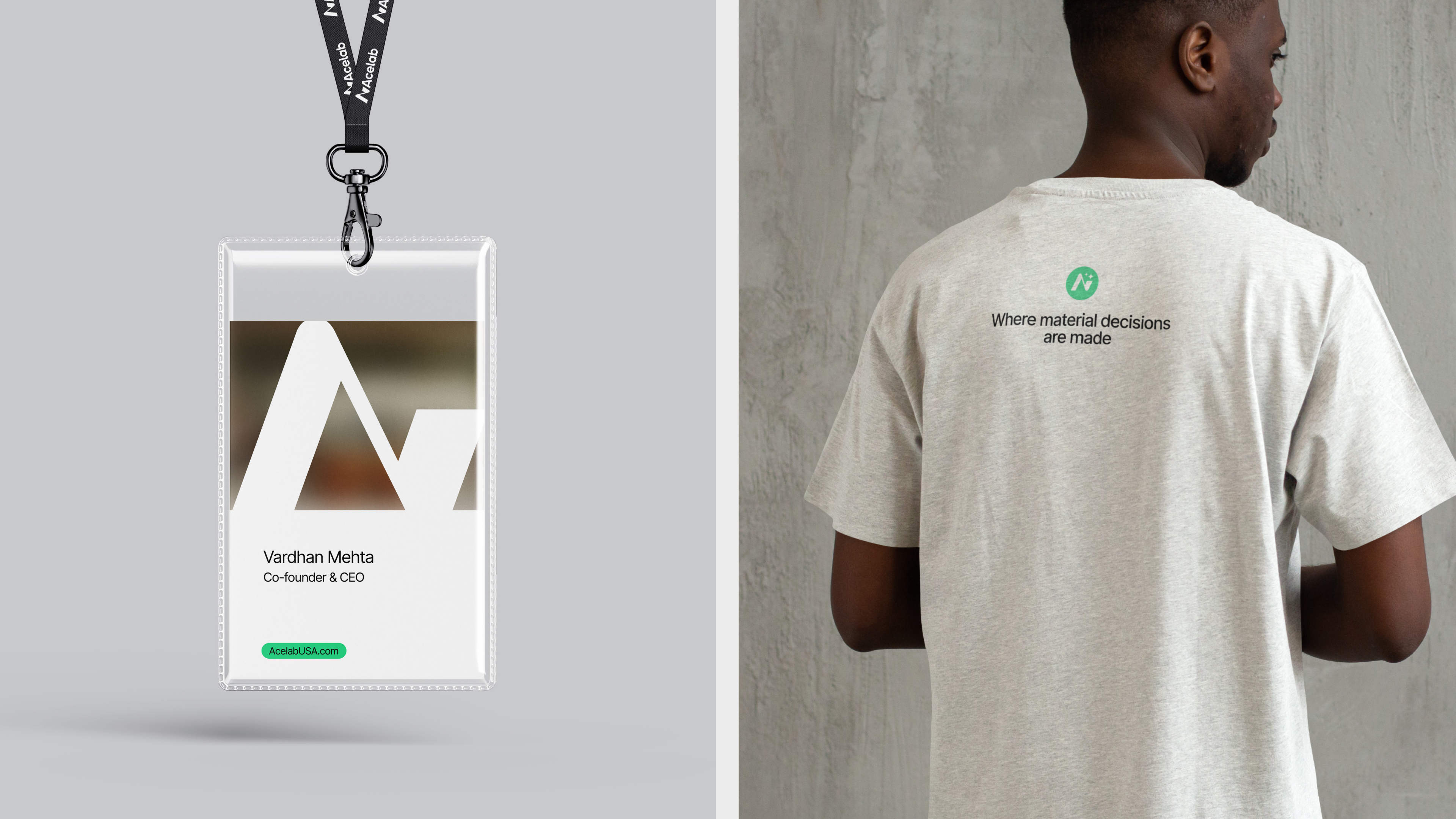
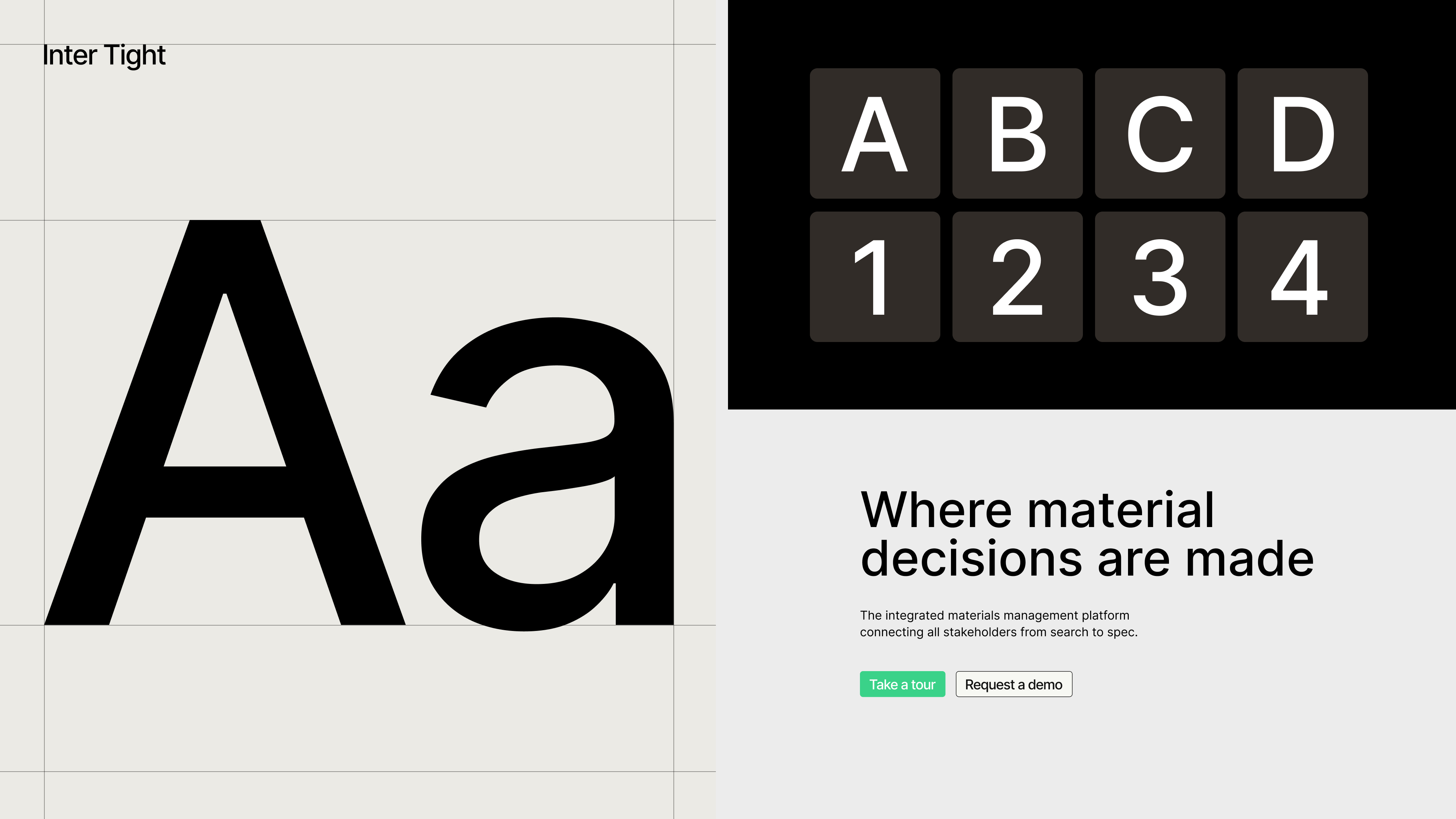
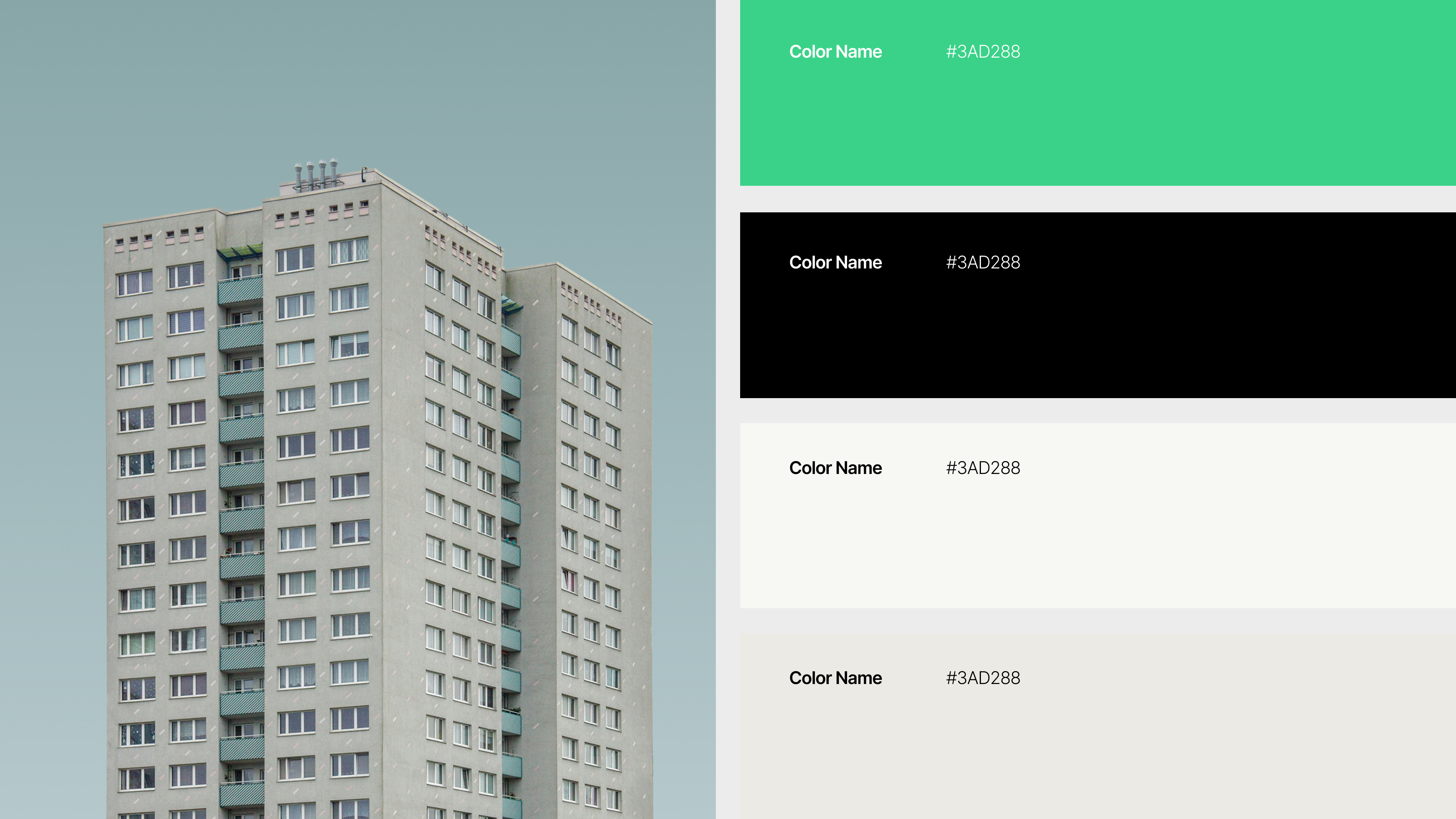
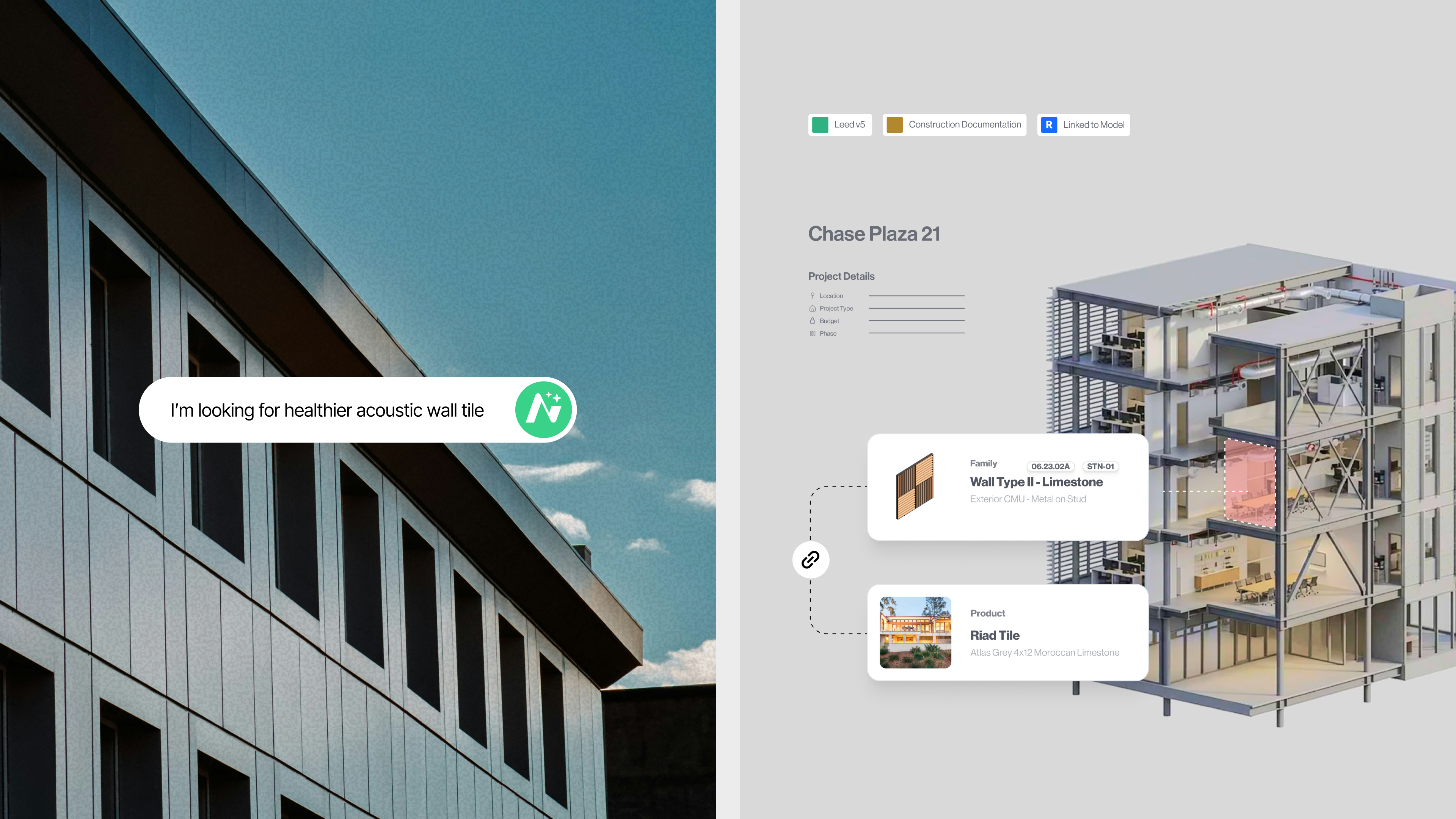
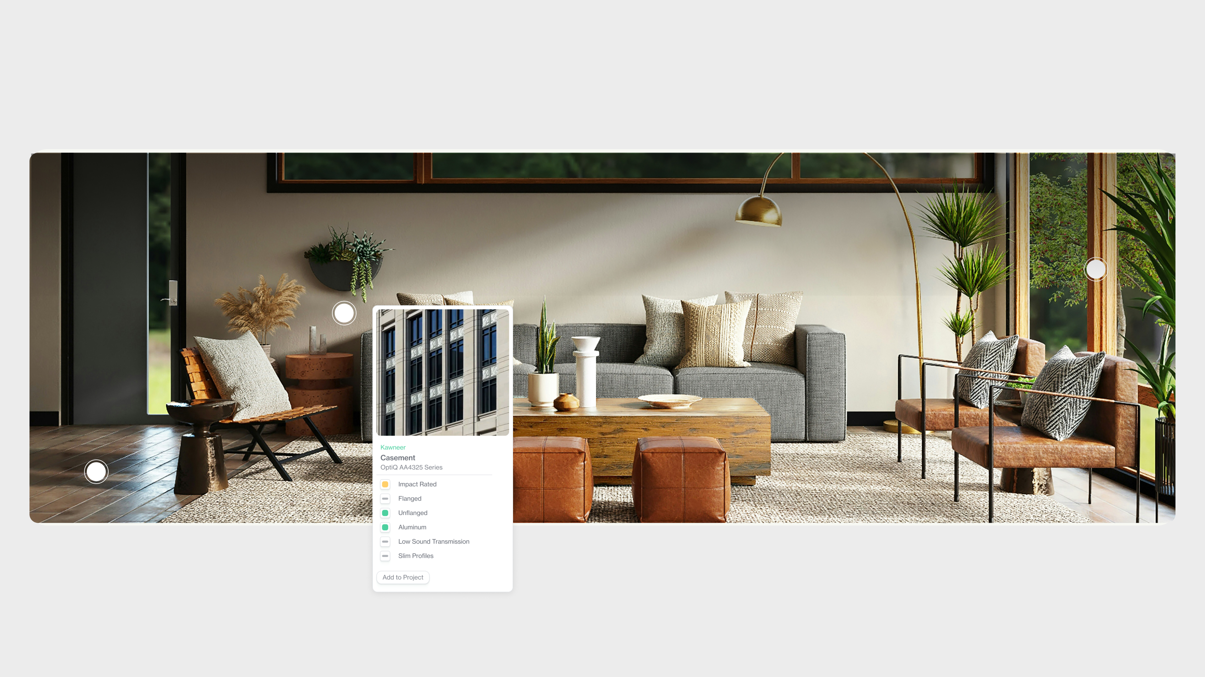
03: Visual Language We rebuilt the visual system from the ground up. The new direction trades the high-contrast tech palette for a refined, light-forward aesthetic grounded in the visual culture of architecture and design. Editorial typography, restrained color, and the use of real architectural photography replace the heavy UI and geometric abstractions of the old system. Layouts breathe. Hierarchy is intentional. The overall effect is a brand that feels less like a SaaS dashboard and more like a platform architects would actually want to use.
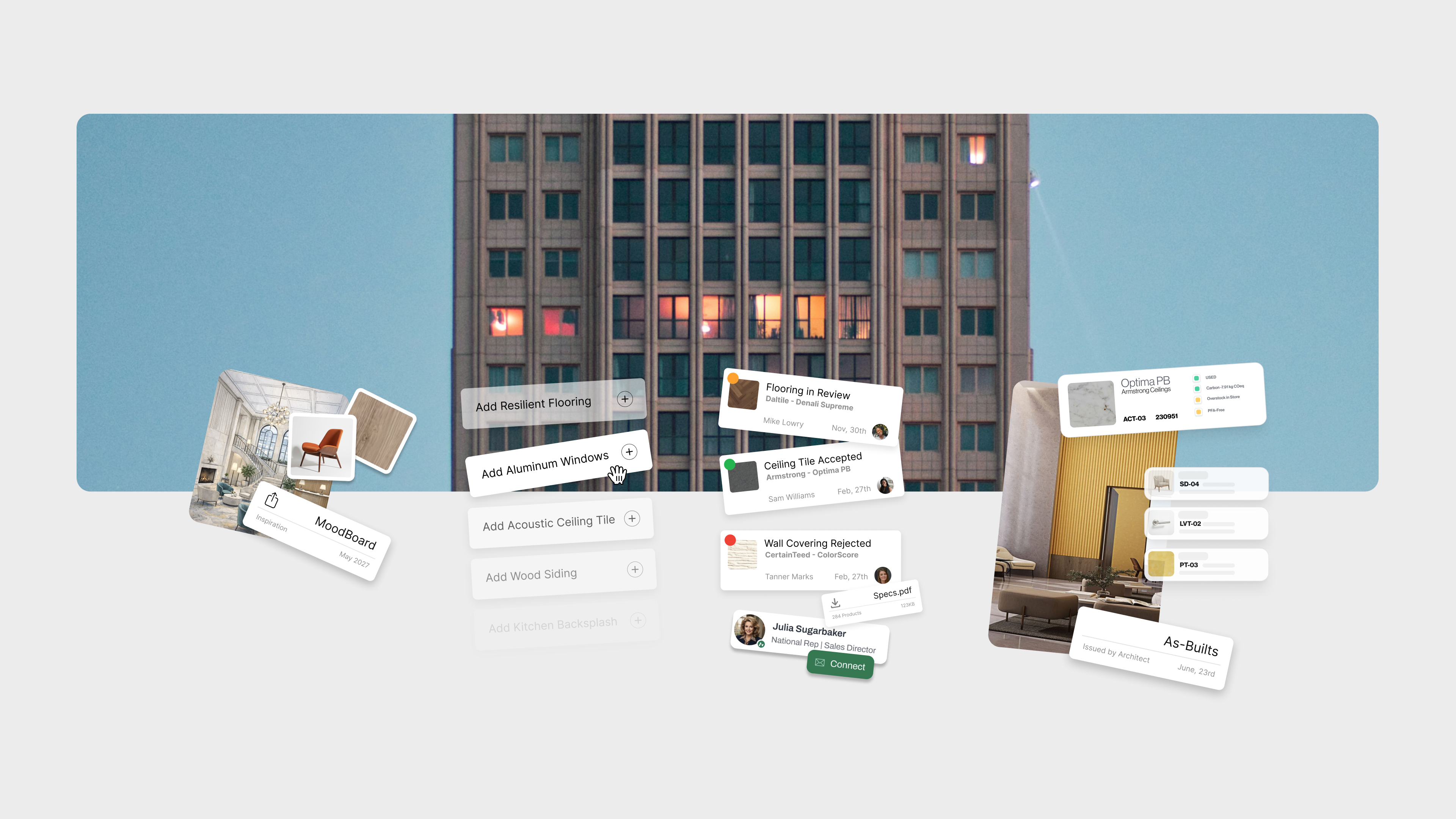
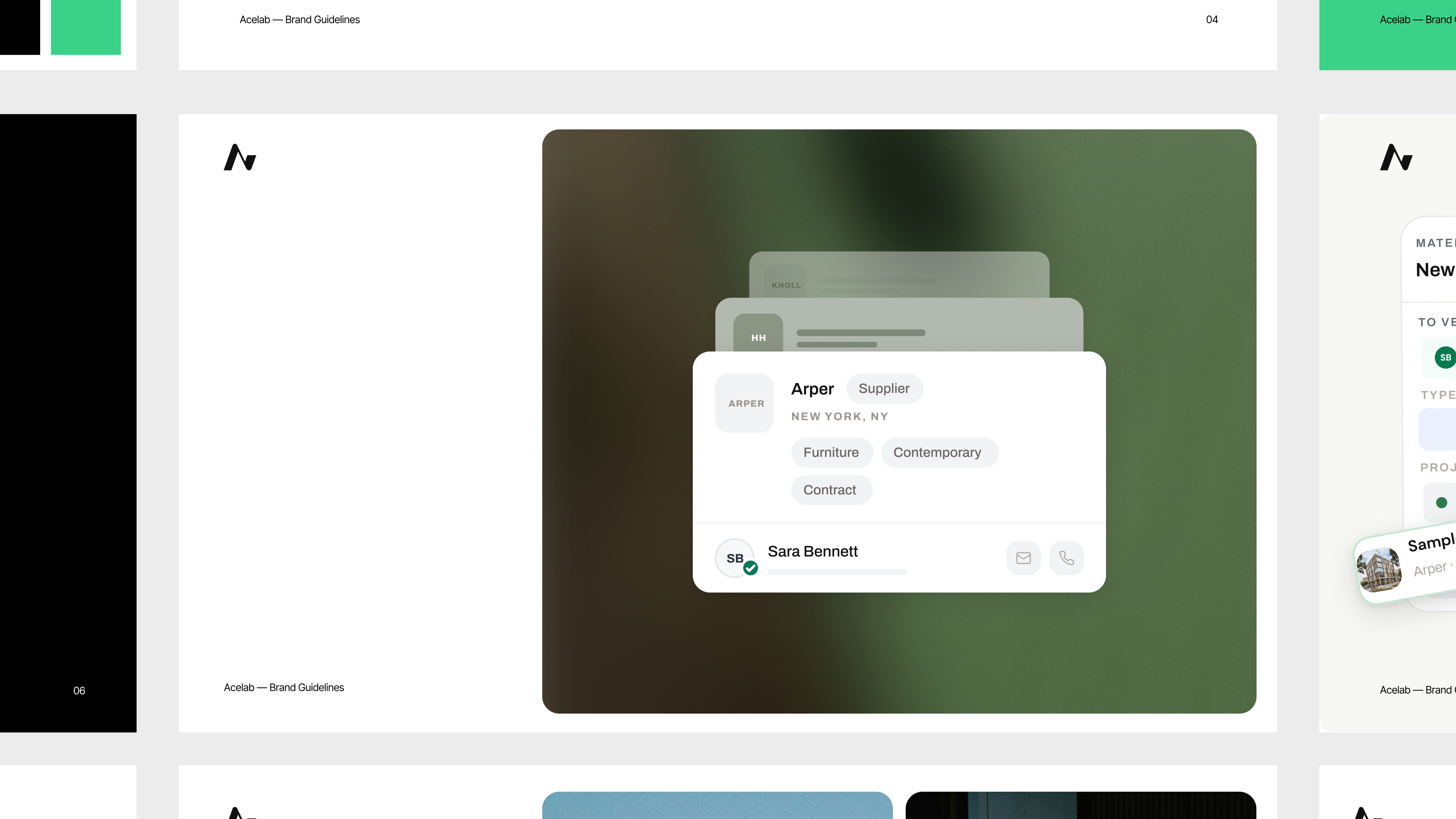
04: Website Overhaul The previous acelabusa.com was feature-dense and visually noisy—built to explain, not to persuade. We redesigned the experience from the ground up: cleaner structure, clearer narrative, and a design system that lets the product speak without overwhelming the visitor. The new site leads with value—what Material Hub does for architects, owners, and manufacturers—before diving into capability. First impressions now match the platform's actual sophistication.
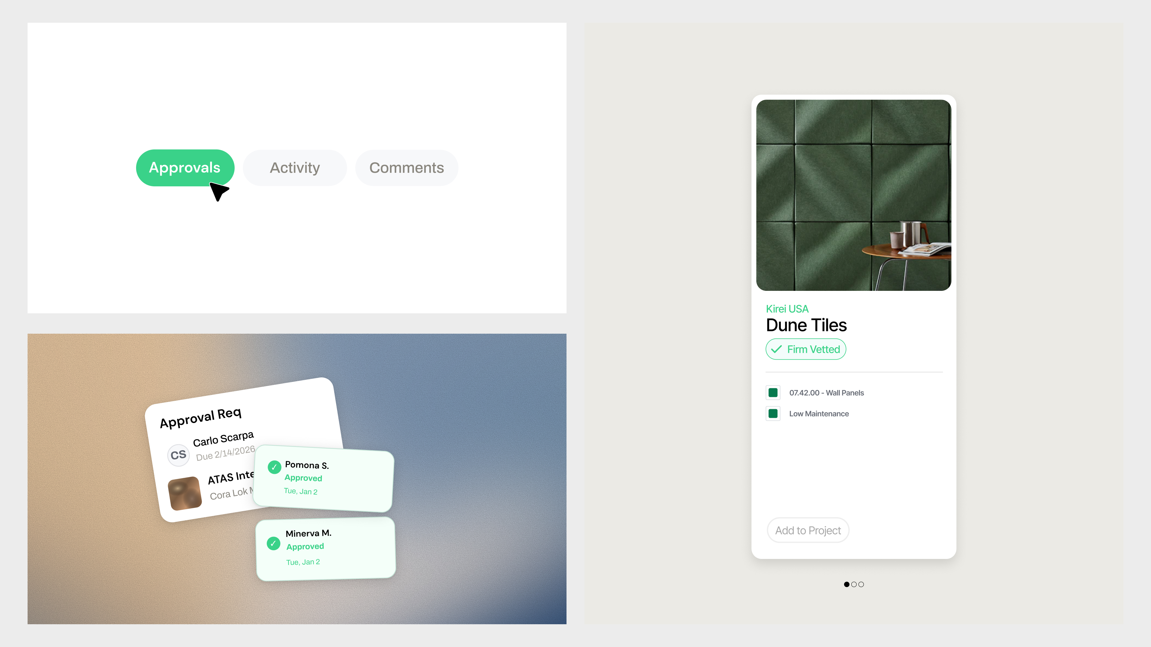
05: Collateral & Brand System We extended the new system across marketing collateral and brand touchpoints, and established a cohesive design language that scales. The result is a brand that teams can execute consistently—across decks, campaigns, and digital surfaces—without losing the refinement of the core identity.
The Result: Acelab now presents with the clarity and credibility its platform has earned. The refreshed brand closes the perception gap between product and identity—speaking directly to architects and design professionals in a visual language they recognize and respect. Material Hub no longer looks like a tool built for engineers. It looks like a platform built for the people who shape the built environment.
The Problem: Acelab's platform had matured well beyond what its brand was communicating. The previous identity—built around high-contrast black and green, Archivo typography, and a fragmented visual system—signaled startup energy where the product had earned enterprise authority. Collateral was inconsistent. The website felt cluttered and feature-led rather than value-led. And in a competitive landscape, Acelab's visual language was creating a perception gap that the product didn't deserve.The audience is architects and design professionals: people with a trained eye, high aesthetic standards, and zero patience for brands that don't communicate competence immediately. The old brand wasn't earning that first impression.
The Solution: A focused brand lift and complete digital overhaul—sharpening strategy, rebuilding the visual language, and redesigning the website to reflect the platform's true depth and the professionalism of the people it serves.
01: Brand Audit We started with a full audit across Acelab's website, collateral, social presence, and product surfaces. The pattern was clear: the brand had been built for momentum, not maturity. The black-and-green palette, heavy geometric logo treatment, and dark UI-forward layouts created visual tension with the actual user—architects and design leads who live in clean, considered environments. The audit anchored the strategic direction: move away from tech-tool aesthetics and toward the visual language of the design and architecture world Acelab actually serves.
0
2: Brand Strategy We repositioned Acelab's visual identity around clarity, craft, and professional credibility. The strategy wasn't about chasing trends—it was about closing the gap between what the platform delivers and how it shows up. If the product helps architects make better, faster, more informed material decisions, the brand needed to feel like it belongs in that world: considered, precise, and confident without being loud.03: Visual Language We rebuilt the visual system from the ground up. The new direction trades the high-contrast tech palette for a refined, light-forward aesthetic grounded in the visual culture of architecture and design. Editorial typography, restrained color, and the use of real architectural photography replace the heavy UI and geometric abstractions of the old system. Layouts breathe. Hierarchy is intentional. The overall effect is a brand that feels less like a SaaS dashboard and more like a platform architects would actually want to use.
04: Website Overhaul The previous acelabusa.com was feature-dense and visually noisy—built to explain, not to persuade. We redesigned the experience from the ground up: cleaner structure, clearer narrative, and a design system that lets the product speak without overwhelming the visitor. The new site leads with value—what Material Hub does for architects, owners, and manufacturers—before diving into capability. First impressions now match the platform's actual sophistication.
05: Collateral & Brand System We extended the new system across marketing collateral and brand touchpoints, and established a cohesive design language that scales. The result is a brand that teams can execute consistently—across decks, campaigns, and digital surfaces—without losing the refinement of the core identity.
The Result: Acelab now presents with the clarity and credibility its platform has earned. The refreshed brand closes the perception gap between product and identity—speaking directly to architects and design professionals in a visual language they recognize and respect. Material Hub no longer looks like a tool built for engineers. It looks like a platform built for the people who shape the built environment.
.jpg)

.jpg)

.jpg)