Loxo isn’t just redefining recruiting technology—we’re rewriting how a brand in this space can look, sound, and feel. Our approach is bold by design: we push boundaries, break patterns, and build creative that stands out in a sea of sameness. The brand needed to entertain as much as it informed, to feel approachable and human while still carrying the weight of a category-defining product.
.webp)
Loxo
INDUSTRY
B2B SaaS RECRUITING
AGENCY
AlvaLabs
ROLE
CREATIVE DIRECTOR
10%
INCREASE IN ORGANIC BRANDED SEARCH
42%
IN WESITE BRAND GROWTH
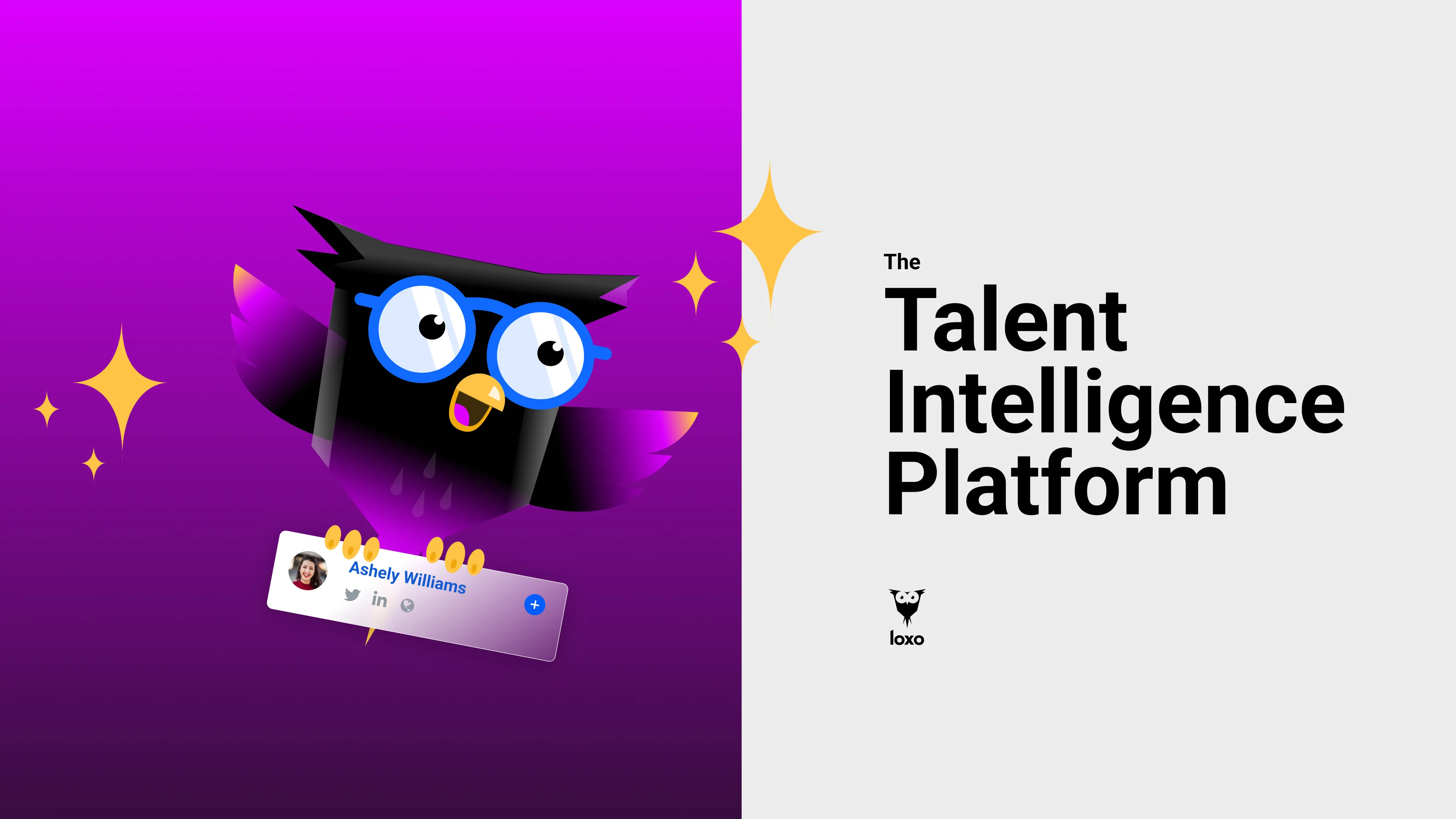
Loxo invented the Talent Intelligence Platform because they saw that recruiters needed a better way to work—with less disparate tools and more efficiency. Loxo's TIP is a horizontally-integrated suite of data-driven and AI-powered products designed to bring every stage of your workflow under one easy-to-use roof: from sourcing talent and engaging candidates, to growing your business, and beyond. So you can spend less time clicking, and more time making things click.
The Ask:
Loxo was in need of a Brand Refresh to revitalize their visual identity and continue to position themselves as the category leader in recruiting software. Without a design system or brand guidelines, our goal was to not only breathe new life into the brand but create a system that allowed for consistent visual and verbal language.
The Solution:
To address this, we broke our solution into a 4 step process.
01. BRAND AUDIT
Before we could make any adjustments, we had to know what was already working and what wasn't. In order to do this we took a deep-dive into the current brand, it's core ICP and competitive landscape. By doing this we were able to pull out key learnings that would direct our strategy for our 3 main verticals—Visuals, Verbal and Online Presence.
02. MESSAGING & VISUAL LANGUAGE
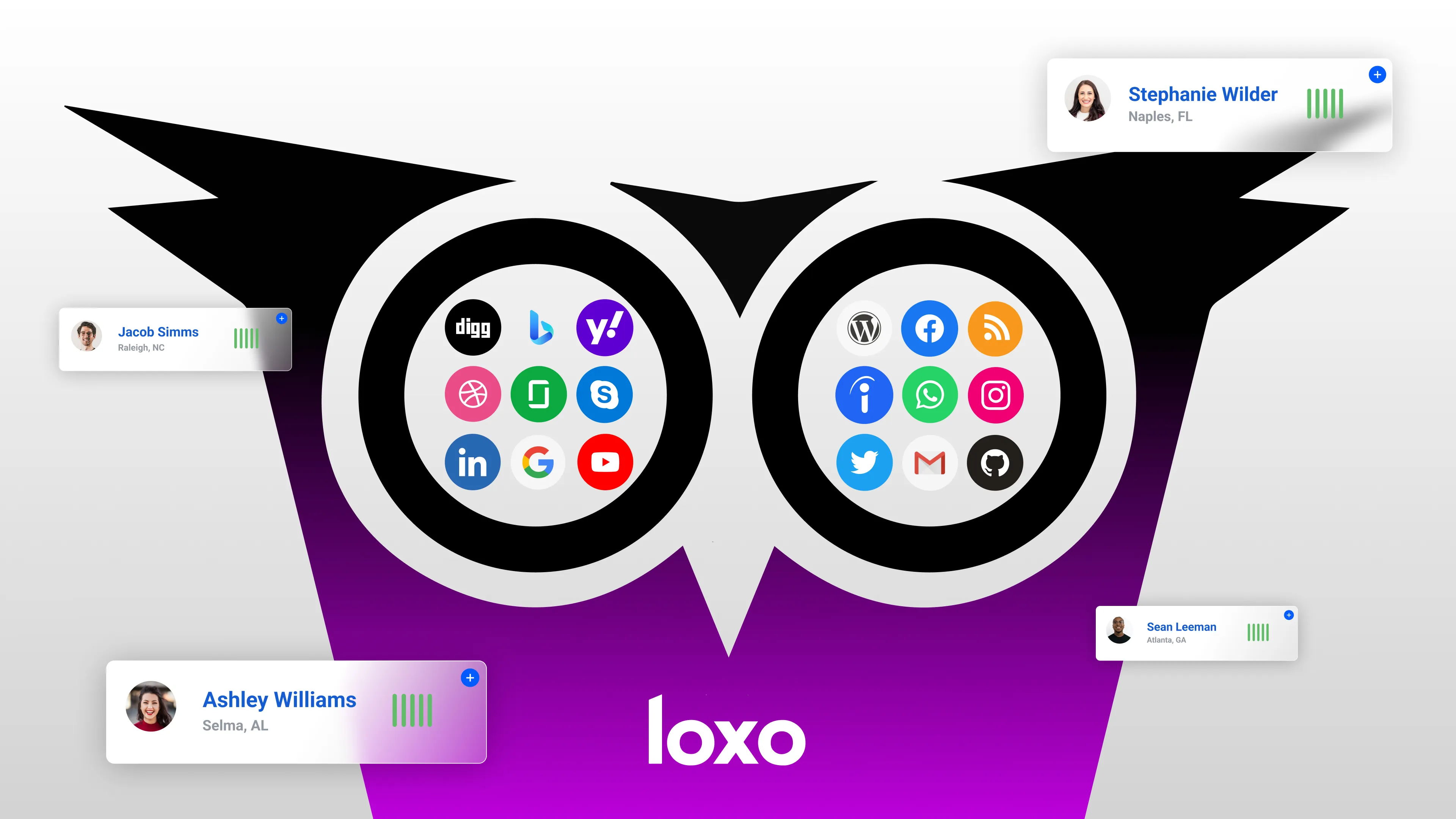
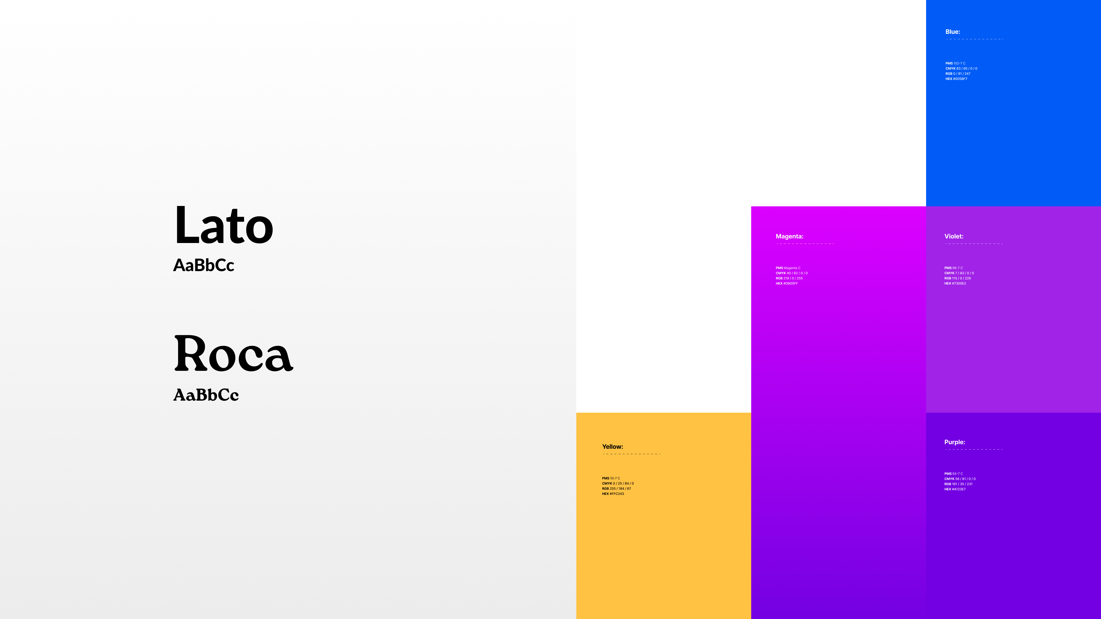
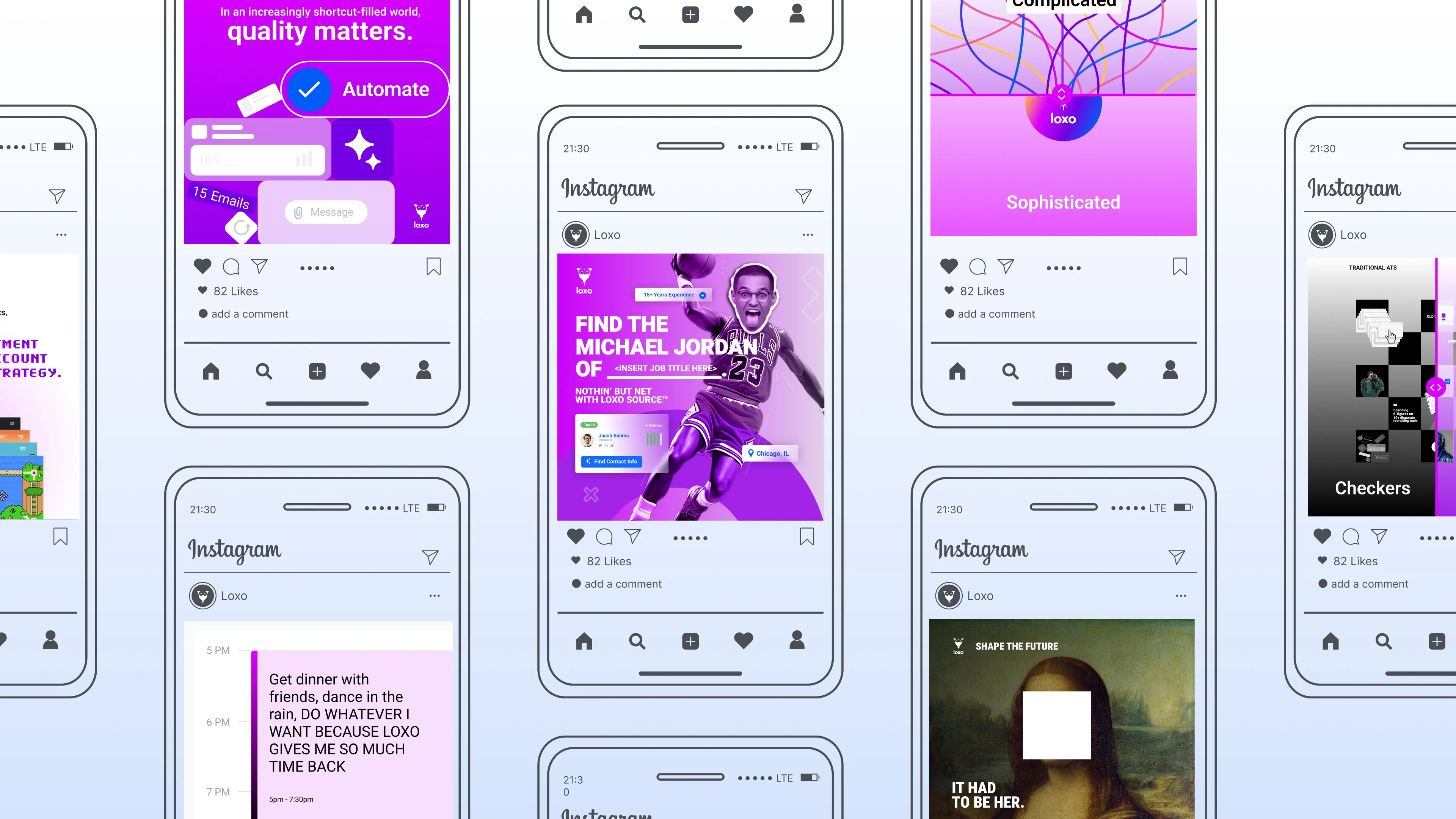
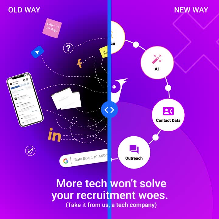
To infuse a more personality into the brand we first focused on crafting a tone of voice that reflects playfulness, humor, and creativity—from there we then let our visual language support that story through a brighter, more saturated color palette, and an ownable approach to photography style and execution.
03. ONLINE PRESENCE
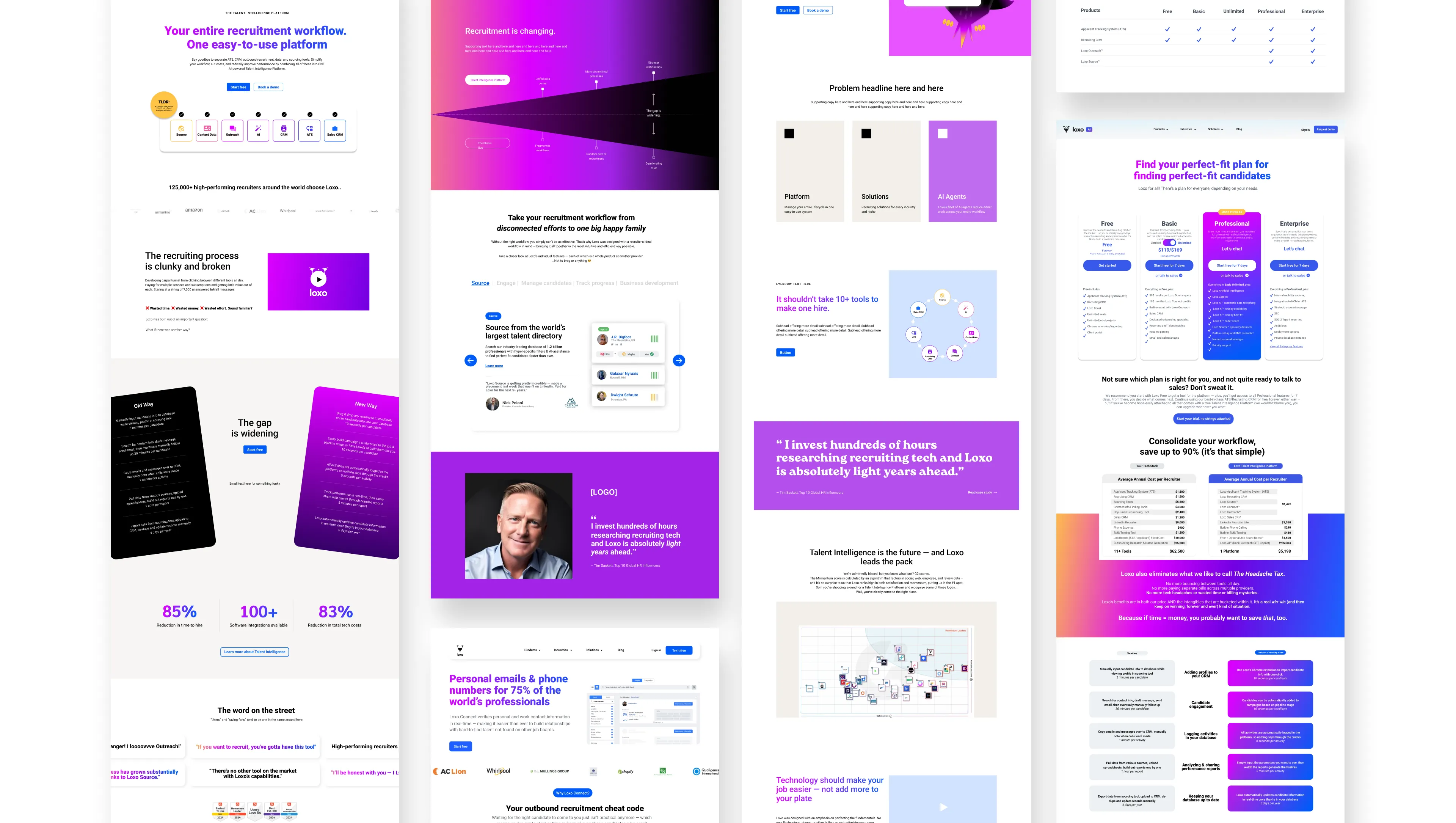
Since Loxo already had an online presence, it was now time to take more of a critical eye to the website. We first took a look at updating the overall narrative and messaging on the most trafficked pages, followed by visual updates.
04. INTEGRATED APPROACH
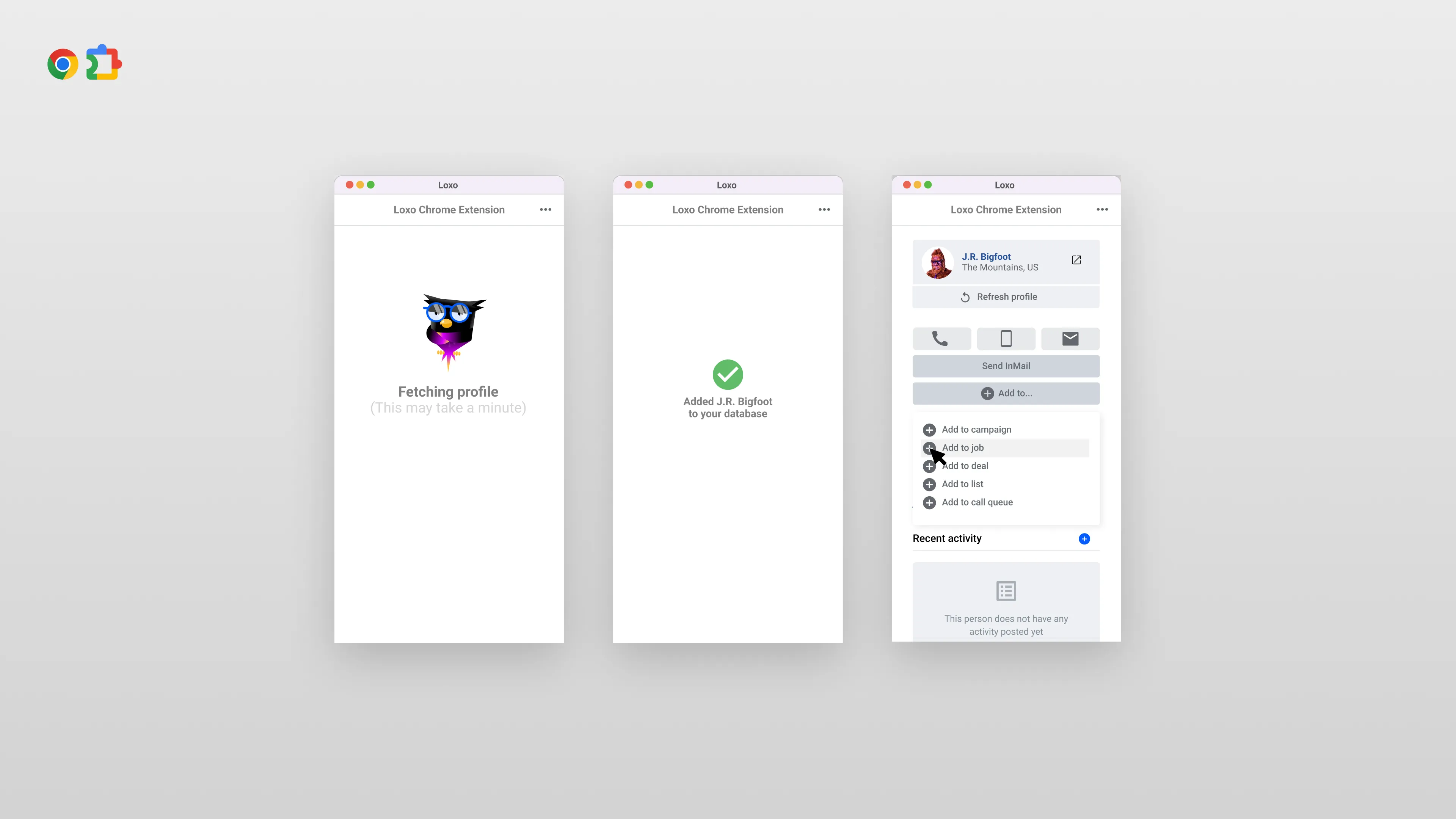
We then ensured consistency across all brand touchpoints, including the website, social media, and marketing collateral by implementing the refreshed messaging and visual elements cohesively—including a brand new product demo video that highlights the ease-of-use of the Loxo platform and it's workflow.
The Ask:
Loxo was in need of a Brand Refresh to revitalize their visual identity and continue to position themselves as the category leader in recruiting software. Without a design system or brand guidelines, our goal was to not only breathe new life into the brand but create a system that allowed for consistent visual and verbal language.
The Solution:
To address this, we broke our solution into a 4 step process.
01. BRAND AUDIT
Before we could make any adjustments, we had to know what was already working and what wasn't. In order to do this we took a deep-dive into the current brand, it's core ICP and competitive landscape. By doing this we were able to pull out key learnings that would direct our strategy for our 3 main verticals—Visuals, Verbal and Online Presence.
02. MESSAGING & VISUAL LANGUAGE
To infuse a more personality into the brand we first focused on crafting a tone of voice that reflects playfulness, humor, and creativity—from there we then let our visual language support that story through a brighter, more saturated color palette, and an ownable approach to photography style and execution.
03. ONLINE PRESENCE
Since Loxo already had an online presence, it was now time to take more of a critical eye to the website. We first took a look at updating the overall narrative and messaging on the most trafficked pages, followed by visual updates.
04. INTEGRATED APPROACH
We then ensured consistency across all brand touchpoints, including the website, social media, and marketing collateral by implementing the refreshed messaging and visual elements cohesively—including a brand new product demo video that highlights the ease-of-use of the Loxo platform and it's workflow.

.webp)
.webp)

.webp)


.webp)
