Accord

INDUSTRY

B2B SaaS—Revenue Excellence Platform

ROLE

Creative Director

SERVICES

Brand Refresh, Website Overhaul, Brand Strategy, Brand Support
6 weeks

BRAND SPRINT

100%

IMPROVEMENT IN MARKET PERCEPTION

As a fast-growing leader in revenue execution, Accord needed a brand that reflected its maturity and ambition. The previous identity felt early-stage—bright gradients, playful illustrations, inconsistent visuals, and a website that didn’t communicate the sophistication or credibility of the platform. In a crowded landscape where competitors with less capability appeared more established, Accord needed a brand that signaled clarity, trust, and differentiation.

The Problem:
Accord’s product had advanced far beyond the perception created by its outdated brand. The visual language lacked cohesion, the website felt cluttered and juvenile, and the overall system didn’t support upmarket momentum. The brand blended into a sea of look-alike SaaS competitors—Dock, Recapped, Aligned, Outreach, and Trumpet—all of whom used similar colors, flat illustrations, and youthful design cues. To win bigger deals and command authority, Accord needed a brand that matched its product’s depth and ambition.

The Solution:
A complete brand transformation—reimagining strategy, design, and digital experience to create a modern, premium identity that reflects Accord’s true capability and separation in the market.

01: Brand Audit
We conducted a full audit across Accord’s website, sales materials, product screens, social presence, and internal collateral. Benchmarking against the competitive set revealed a category saturated with neon palettes, generic templates, and playful illustration styles. This insight anchored the strategy: zig where everyone else zags by elevating Accord into a more editorial, mature visual territory.

02: Brand Strategy
We repositioned Accord around clarity, confidence, and sophistication. Rather than chase industry trends, the strategy focused on creating distinction—moving from loud and youthful to deliberate, structured, and premium. This established Accord as the credible, enterprise-ready choice in a space dominated by interchangeable SaaS aesthetics.

03: Visual Language
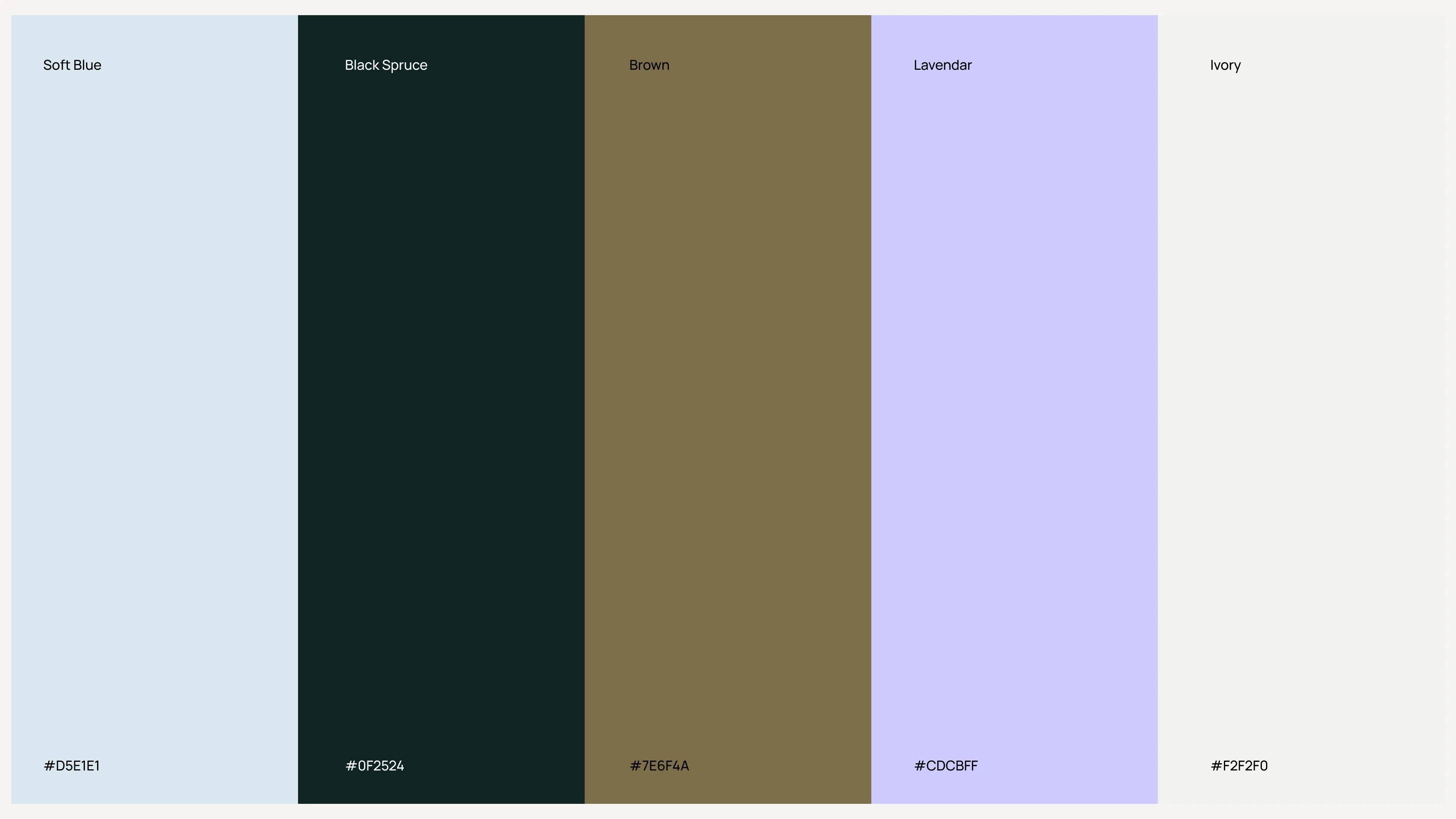
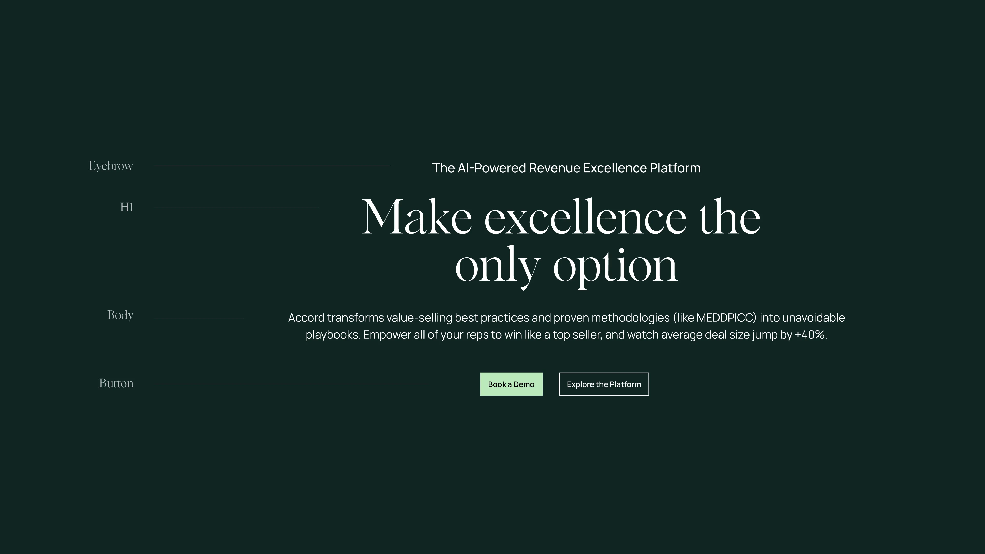
We rebuilt Accord’s visual language from the ground up. The new system introduces a refined palette, editorial typography (Albra + Manrope), a modernized logo, architectural photography, and patterns derived from the geometry of the mark itself. Layouts became quieter and more spacious, allowing content to breathe and elevating the overall brand presence.

04: Logo Resdesign
The original logo lacked sharpness and authority. We refined its geometry, removed gradients, improved spacing, and delivered a more modern, sentence-case wordmark. The updated mark feels confident, scalable, and aligned with Accord’s evolved identity.

05: Website Overhaul
The previous inaccord.com site was visually noisy and structurally cluttered. We rebuilt the experience with a premium, editorial feel—grounded in product clarity, refined storytelling, and a clean, intentional design system. The new website elevates perception immediately, helping buyers understand both the value and maturity of the platform.

06: Global Brand Support
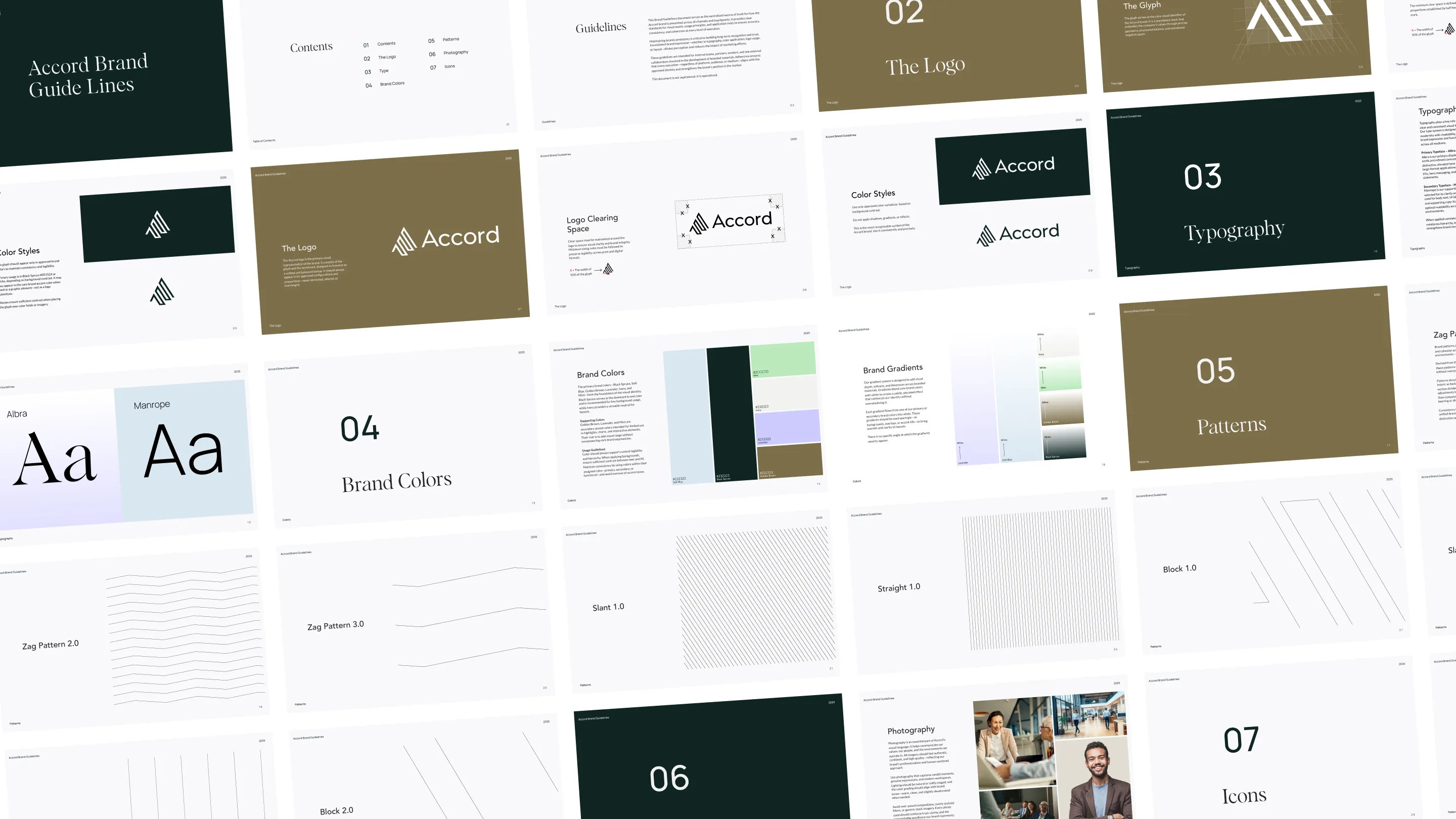
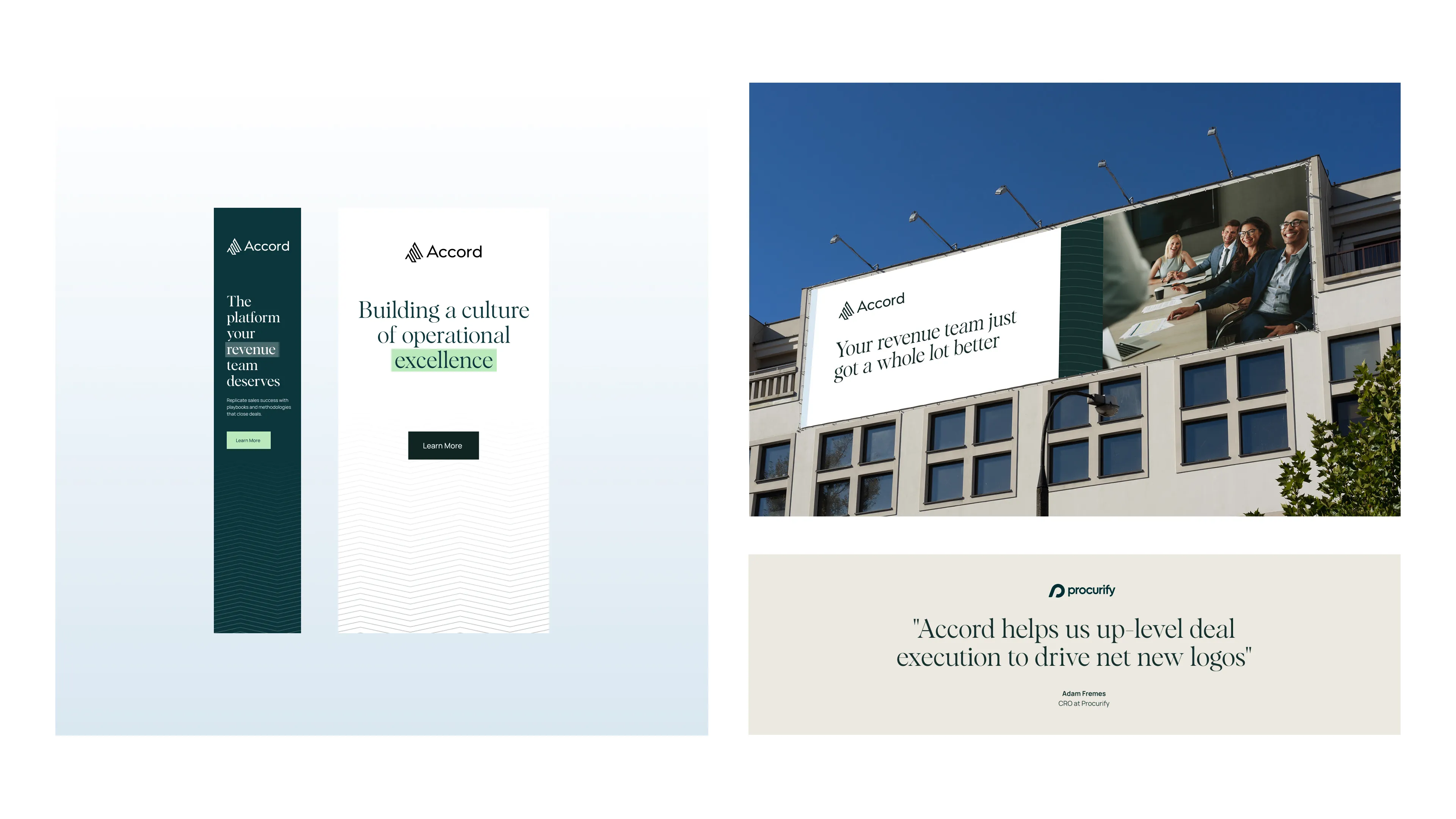
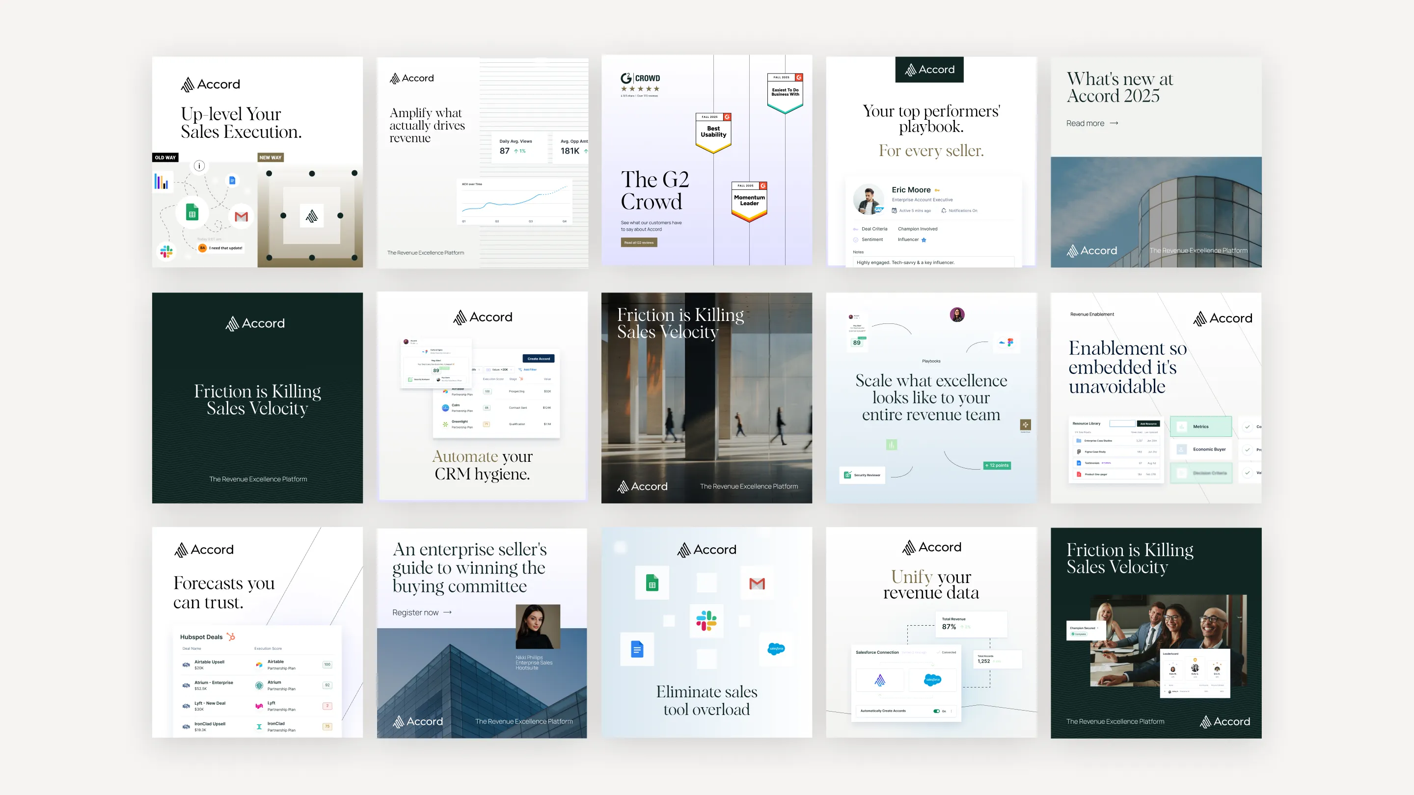
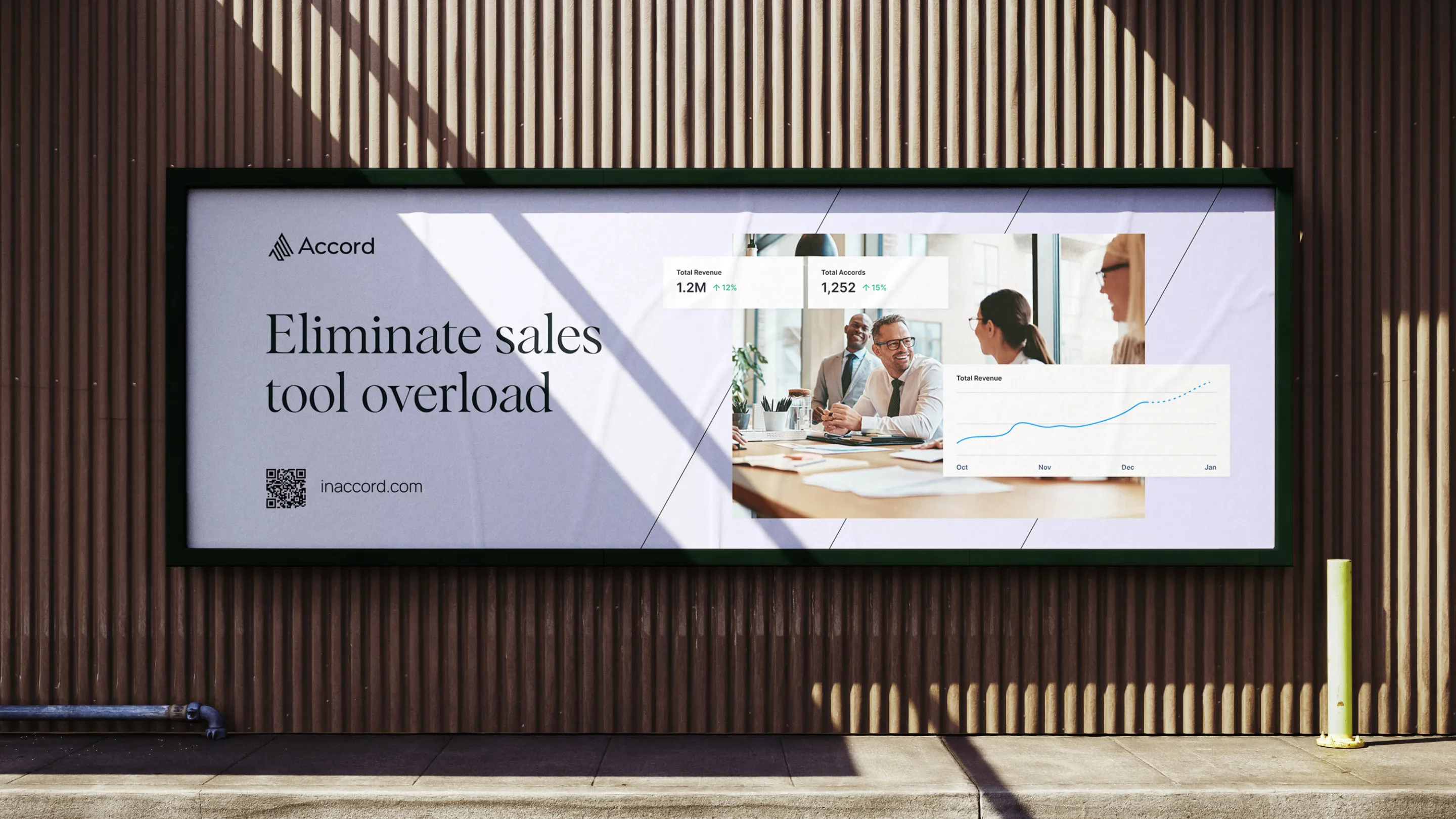
We extended the new system across event assets, mailer boxes, pitch decks, sales materials, packaging, and social campaigns. To ensure consistency across teams and markets, we developed scalable brand guidelines, templates, and libraries that unified execution across the entire organization.

The Result:
Accord now shows up with the authority, maturity, and distinction of a true category leader. The refreshed brand is clear, cohesive, and premium—supporting stronger market perception, better sales alignment, and a unified identity across every touchpoint. Accord no longer blends into the SaaS landscape. It stands apart—with intention, confidence, and a brand worthy of the product behind it.
As a fast-growing leader in revenue execution, Accord needed a brand that reflected its maturity and ambition. The old system felt scattered and dated, masking the sophistication of the platform. The new identity brings focus, discipline, and distinction—finally aligning the brand with the caliber of the product.

Brand Strategy

In a category crowded with bright colors, playful illustrations, and template-driven SaaS design, we saw an opportunity to reposition Accord as the sophisticated outlier. Competitors like Dock, Recapped, Aligned, Outreach, and Trumpet lean heavily into neon palettes, hyper-flat graphics, and youthful typefaces—visual languages that signal speed and scrappiness, but not necessarily trust, rigor, or enterprise-readiness. Accord needed to stand in a different light.

Our strategy was to elevate rather than compete. We shifted the brand toward a more mature, editorial aesthetic—rooted in quiet confidence, refined typography, and a palette designed to feel timeless instead of trendy. By replacing playful gradients and cartoonish visuals with structured layouts, architectural photography, and a typographic system that balances intelligence with warmth, we positioned Accord as the most credible, premium choice in the space.
Where competitors chase attention, Accord commands it.
Where others feel interchangeable, Accord feels intentional.
And where the category trends toward sameness, Accord now stands alone—clear, elevated, and unmistakably built for leaders, not just users.

This is the brand strategy: clarity over noise, depth over decoration, and a visual identity designed to reflect the sophistication of the product and the ambition of its customers.

Logo Design

Every great identity begins with clarity. And the old Accord logo, while functional, was caught somewhere between ambition and execution. The stacked-line symbol hinted at upward motion, but the gradients and soft edges diluted its confidence. The letterforms felt tight, compressed—more “startup rush” than “trusted operator.” It lacked air, precision, and the timelessness required for a company built on alignment and partnership.

So we rebuilt it—piece by piece.

The new Accord mark sharpens the original idea into something modern, architectural, and unmistakably confident. We removed the gradient to eliminate visual noise and commit to a single, assertive tone. The icon is now cleaner, more geometric, and structurally balanced—an emblem that stands up on its own and scales with dignity from business card to billboard.
The wordmark was equally refined. We introduced a sentence cased approach, proper spacing to let every character breathe. The shapes are now more deliberate, more human, and more premium—reflecting a brand that understands both the rigor of operations and the nuance of relationships. What once felt compressed and playful now feels poised and professional.

Visual Identity

Accord’s previous visual identity was energetic, but unfocused. The gradients, saturated blues, and stock-style illustrations pushed the brand toward a generic SaaS aesthetic—bright, busy, and competing for attention rather than commanding it. Every element worked hard, but nothing worked together. There was motion, but no maturity. Color, but no calm. Information, but no hierarchy.

We rebuilt the system with intention and restraint.

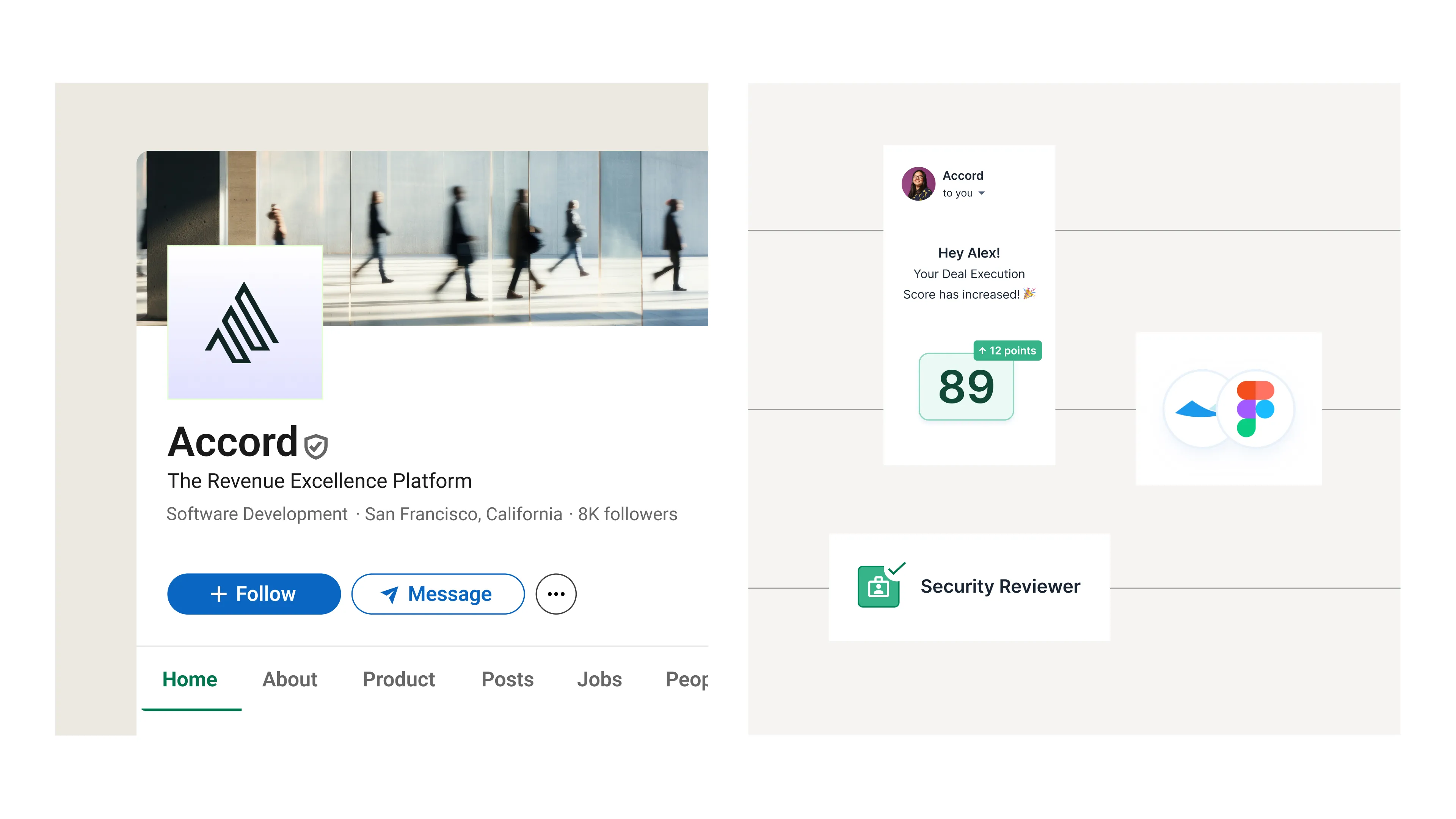
The new identity shifts from loud saturation to a refined, editorial palette—deep greens, soft neutrals, and subtle gradients that support the brand rather than overpower it. Illustration gave way to product-first clarity and human storytelling, anchored by confident photography and clean data visualizations.
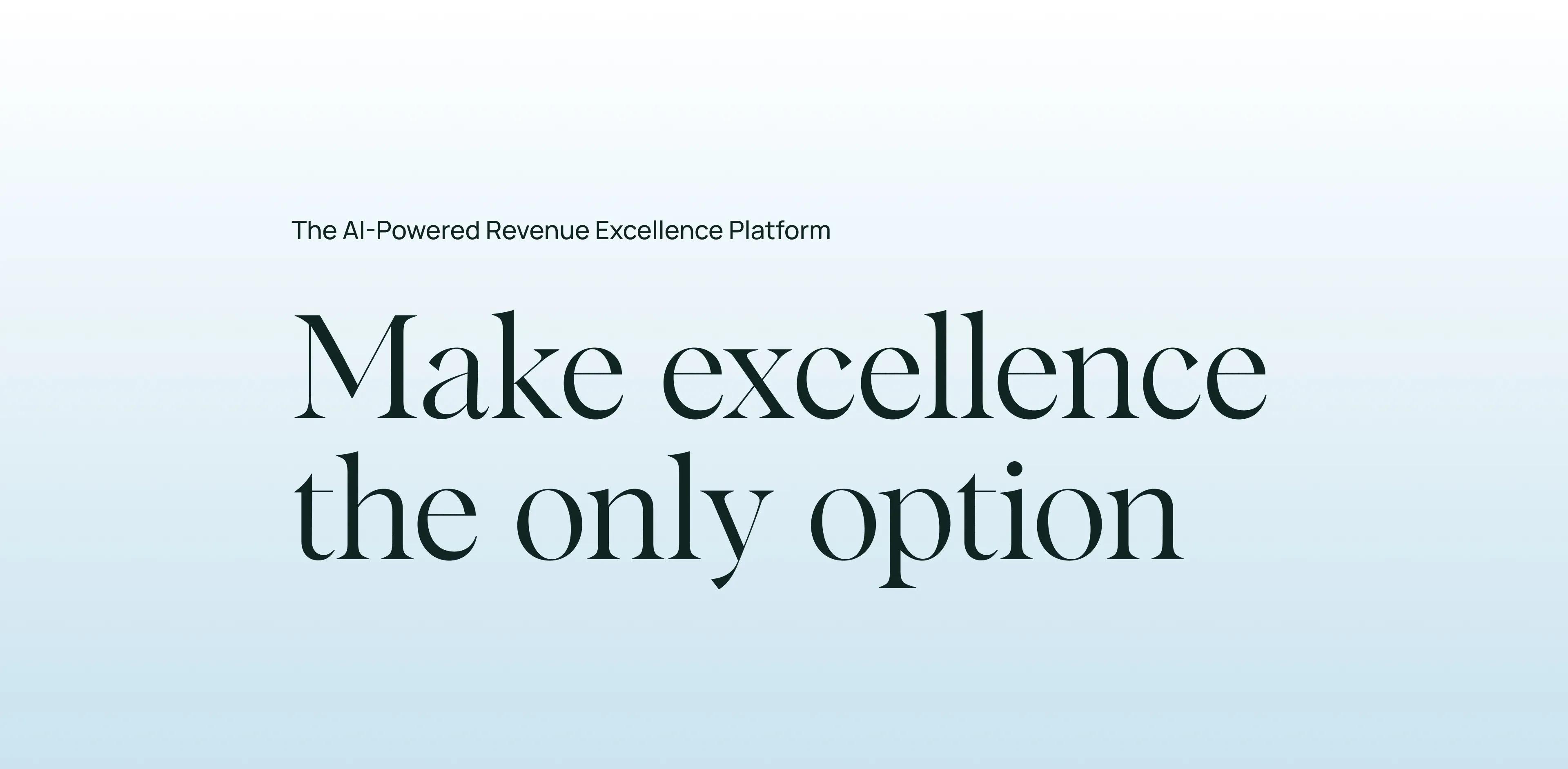
Typography evolved from a playful geometric sans to a more sophisticated, modern type system that reads with elegance and authority. Layouts are now quieter, more structured, and deliberately spacious—letting the product, not the decoration, carry the message.

The result is a brand that feels aligned, elevated, and unmistakably premium.
A system built not to shout, but to signal confidence.
A visual language finally worthy of the platform it represents.

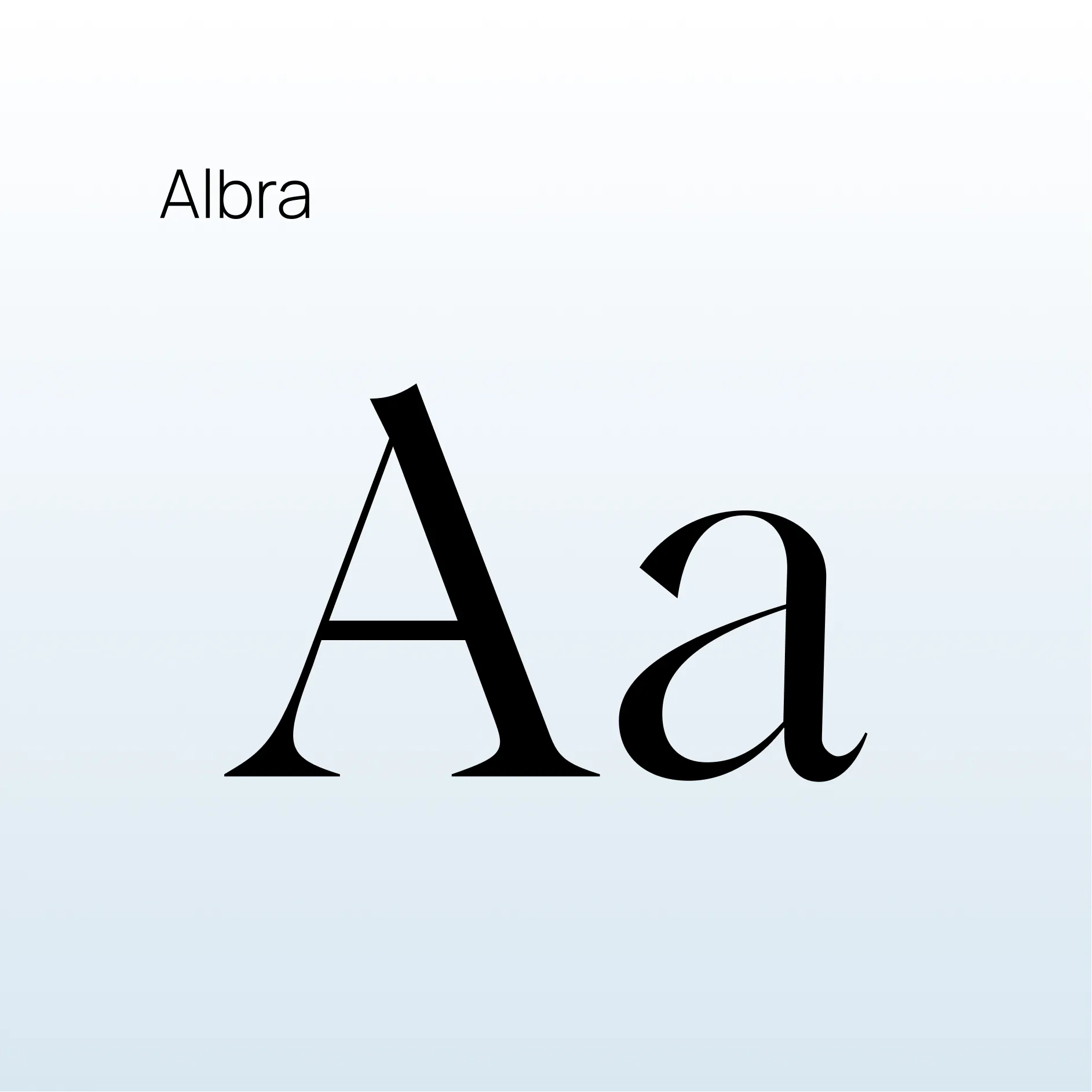
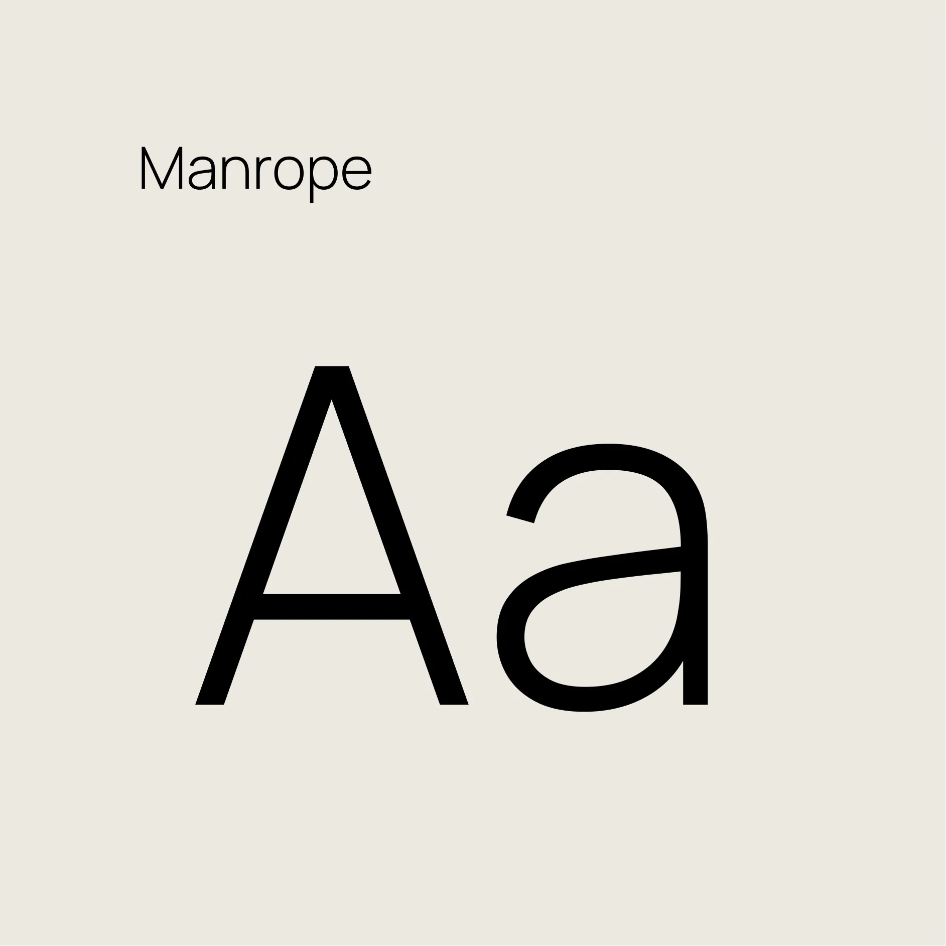
Typography: The new typography pairs Albra, a sophisticated serif, with Manrope, a modern sans—creating a balance of elegance and clarity. This combination elevates Accord’s voice, bringing structure and warmth to headlines while keeping body copy highly readable and contemporary. Together, they form a flexible system that feels premium, confident, and unmistakably aligned with the new identity.

Patterns: Each pattern is built directly from the geometry of the Accord symbol—mirroring its angles, rhythm, and linework. By extending the logo’s core shapes into backgrounds and textures, the system creates a cohesive visual language that feels intentional and distinctly Accord.

Photography: Accord’s photography shifts from generic, hyper-saturated SaaS imagery to a more sophisticated, editorial approach rooted in authenticity and clarity. The new system highlights real human expression, modern work environments, and architectural forms—reinforcing the brand’s focus on trust, alignment, and professional excellence.We balanced warm, candid moments of collaboration with clean, minimal compositions that echo the structure of the logo and pattern system. Natural light, grounded color tones, and considered framing create a sense of calm confidence—allowing people and product to feel honest, capable, and unmistakably premium.The result is a photographic language that feels aligned, human, and credible—imagery that supports the brand without over-styling it, and elevates every touchpoint with clarity and intention.

Website

The previous Accord site was built on bright gradients, dense layouts, and an illustration-heavy style that fought for attention instead of guiding it. It felt busy, transactional, and out of sync with the sophistication of the product. The brand had grown—but the website hadn’t grown with it.The new Accord web experience is a complete reinvention.
We replaced noise with intention, chaos with clarity, and color explosions with a refined, editorial design system. Deep greens, soft neutrals, and subtle gradients set a calm, authoritative tone. Typography carries real presence—elegant, spacious, and unmistakably premium. Product stories are told through modern layouts, expressive photography, and simplified information flow that makes complex solutions feel effortless.
This overhaul goes far beyond aesthetics. It’s a rethinking of how Accord shows up in the world—more confident, more human, and far more aligned with the platform’s value. The result is a web presence that finally matches the maturity of the brand: clear, focused, elevated, and impossible to confuse with the previous site.

A website that doesn’t just look better—
It feels like a brand that has arrived.

Brand Support

A strong identity doesn’t stop at the website—it earns its power everywhere the brand shows up. Once the new Accord system was defined, we expanded it into a complete ecosystem of collateral: event banners, mailer boxes, social ads, sales decks, one-pagers, and conference materials. Each touchpoint became an opportunity to reinforce the brand’s clarity and confidence, replacing the noisy gradients and illustrations of the past with a calm, editorial palette, structured layouts, and human-centered photography.
And because a modern brand must scale beyond a single team or timezone, we built the foundation for global brand control as well. Every element—logo, type, color, patterns, photography, and layout rules—was codified into clear, accessible guidelines that empower every team to execute with precision. Marketing, sales, product, CS, and operations now work from a shared language and library, ensuring the brand shows up consistently across channels, continents, and campaigns.

The result is a cohesive, world-ready system: fast to use, hard to misuse, and unmistakably Accord at every touchpoint.

Previous
Next